The Making of This Website
Okay, get ready for a surreal experience.
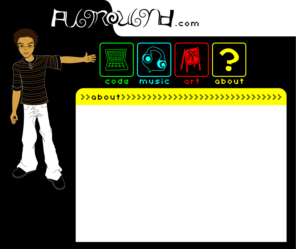
I did the whole layout in Illustrator CS4 over about a day. It really helped to design it in a vector program, as that allowed me to export it at any resolution and see how each fit on the screen. I settled on this resolution because the white main content area just fits in an 800x600 screen, and a standard 1024x768 can just show the full layout.
 |
|
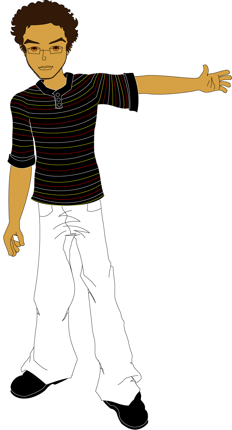
The caricature was done from a single reference image I took, and I stressed my major features to give it more of a cartoonish look. There was actually another version with a little more facial hair, but it made me look too much like a villain, so I "shaved" it. |
|---|
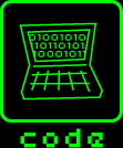
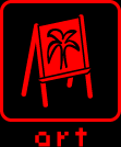
The icons were supposed to be ultra-simple representations of the different fields, and I stayed with a monochrome color scheme so that each page could have an instantly recognizable category. I also kind of like that red, green, and blue are used for the three main categories, as those are like my three "channels".
 |
 |
 |
 |
 |
|---|
Here's the initial layout, as it was in Illustrator. I ended up breaking everything into non-transparent blocks, so that it would still work on IE6. Oh, non-standardized formatting and functionality... (there's a reason I don't do much web design...).