Ambigram Logos
Ever since reading Angels & Demons, I've found these rotationally symmetric words to be fascinating. Whenever I have the chance, I try to design them for random and arbitrary things.
The first one I did was for the back of a card game called "Madness". The cards were double-sided (two halves on one side), so I needed a card back that didn't give away any orientation info. Getting a starting M to end on two S's was a little difficult, but I think it's fairly legible.
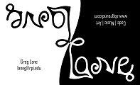
More recently, I've been doing half-black and half-white ambigrams, because that's my thing (see Piano Black / Piano White). My business card was challenging, as the G-E pair was a conflicting shape, and the design went through about four iterations.
The abground logo was finalized much more quickly (two iterations), and even managed to incorporate a cool swirling symbol that I later found out was my zodiac sign (Cancer). Isn't it awesome when things just work out like that?
 |
 |
|
|---|---|---|
a·b·ground.com |
Business Card |
Madness Cards |
